|
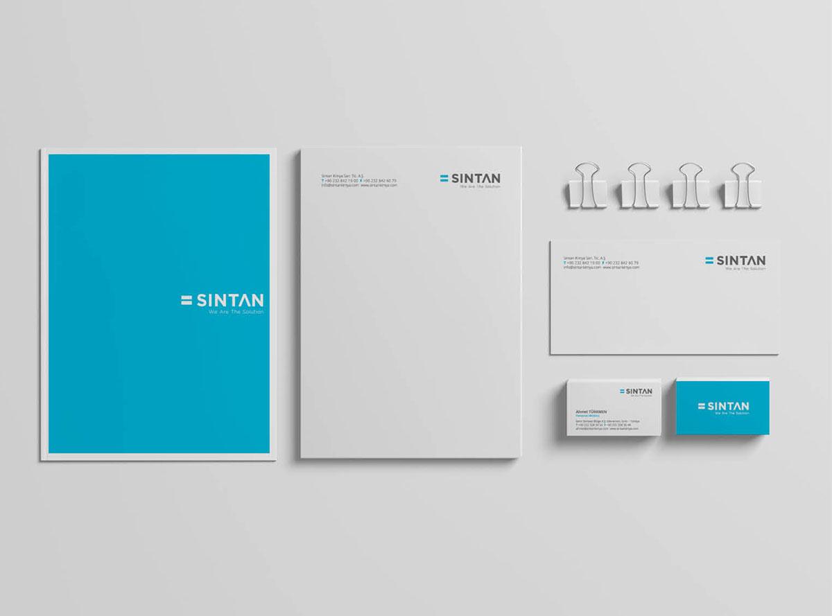
Although Sintan Kimya is competitive on a global scale in terms of technical capability and production infrastructure, it lacked a brand identity that clearly reflected this strength in the market. Our goal was to express the brand’s solution-oriented approach and the technological value it brings to the industry through a simple yet powerful visual identity and a clear message. Sintan Kimya’s key points of differentiation lie in its advanced manufacturing infrastructure and high level of technical expertise. However, these strengths were not sufficiently visible in the market. We aimed to bring this advantage forward with a clear proposition: We have facilities + We have knowledge = We are the solution Based on this idea, the mathematical equals sign (=) used in the logo visually reinforces the brand’s role as a direct provider of solutions. With the new logo and slogan, Sintan Kimya is now positioned not only as a manufacturer, but as a solution partner that helps shape the industry.
|
 |

 |
 |