|
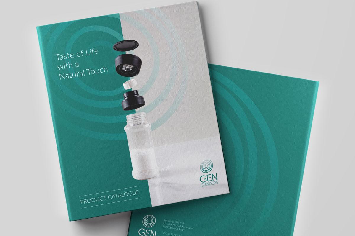
Gen Grinders, a spice grinder manufacturer targeting global markets, wanted its innovative stance—combining natural products with healthy living—to be reflected in its brand language. After analyzing modern consumer habits, the brand’s core need was to create a brand identity that blends naturalness with engineering precision in a single, coherent expression. Drawing inspiration from nature and combining it with technological manufacturing expertise, Gen Grinders delivers not only aroma with every grind, but also health and vitality. To bring this vision together in a simple, trustworthy, and contemporary manner, a new logo design was required. Spices are not only part of food, but also of culture. Gen Grinders defines spices not merely as products, but as a natural touch within a healthy lifestyle. Based on this insight, the idea of a spiral journey toward the heart of nature became the core visual metaphor of the logo. The circular forms in the logo symbolize the effect of grinding that expands from the center outward, while strongly representing the brand’s values of naturalness, purity, and life. The open-ended lines used in the typography convey dynamism and openness, emphasizing the brand’s modern, global character.
|
 |
 |
 |